

Tools Used
Role
Researcher and UI/UX Designer
OVERVIEW
CHALLENGE
GOAL
-
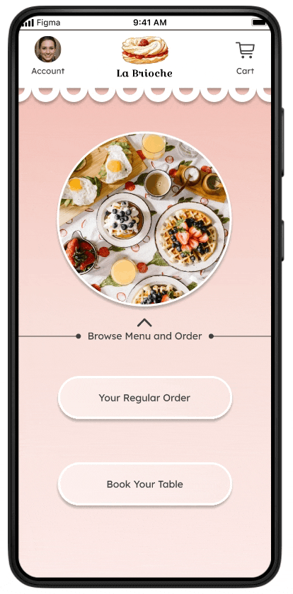
La Brioche is a app used as a digital menu card for the French Patisserie.
-
Ordering of food can be done through this app.
-
Seat reservation can also be done through this app.
-
Nonnative people find menu cards difficult to understand as it is not in their native language which causes a language barrier.
-
People find waiting for the table time wastage when the place is full.
-
Standing in the queue and making the payment is a task for some people who are in hurry.
To build a app for a French Patisserie which can Provides services like
-
Online menu card
-
Ordering food
-
Making payments
-
Booking of a table.
Project Overview
Time Period
12 Weeks
Device
Mobile App
PROBLEM STATEMENT
A French patisserie wants to develop a menu and ordering app for its customers. The app should allow customers to view the patisserie's menu, place an order for pickup or delivery, and pay for their order through the app. The app should be easy to use, visually appealing, and reflect the patisserie's branding. Additionally, the app should have the capability to notify customers of any special promotions or discounts and allow them to earn rewards for frequent orders. The patisserie wants to streamline the ordering process for its customers, reduce wait times, and increase sales.

DESIGN PROCESS


UNDERSTANDING THE USER
Competitive Audit -
A competitive audit was conducted between 3 competitors and the study was documented, to take deep dive into our market to know how the competitors describes themselves in the market.
We analysed every competitor alone to know about their - Target audience, Unique value prepositions, First impressions, Interaction, Visual Design and Content.

USER PERSONAS


VALUE PROPOSITION
1
Different language options.
2
Pre order
options
3
Detailed
Description
4
Payment
options.
5
Easy
checkouts
USER JOURNEY


USER STORY
PERSONA 1
JOSEPH
As a new student in the city who has trouble understanding the language, I want to order at my convenience with language options, So that I can order food conveniently.
''
''
PERSONA 2
ELLIOT
As a cook who is on a budget and takes online bootcamps, I want to have a detailed information about my food and convenient ordering process, so that I can peacefully conduct my work while being outdoors.
''
''
USER FLOW MAP
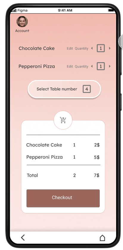
1) Browse menu and and make payment
.jpg)
2) Order regular meal
3) Book a seat
PAPER WIREFRAMES
After collecting the information above I have come up with multiple options for the UI of the La Brioche app.
This is the final UI concept I have to consider which is best suited for this app.
UX design storyboard: Close-up storyboard.
Scenario: To make an order and payment of a regular customer at the patisserie.


LOW-FIDELITY PROTOTYPE

UI STYLE GUIDE

UI SCREENS


USABILITY TEST
A Usability Test was conducted to eliminate any biases.
The test report and insights are as follows-
Study Details -
Research Questions
Participants
Methodology
●How much time do people take
to order food if they order after
coming to the place in person?
●How much time people take to
order their regular order everyday?
●What methods do people take
to make payment after ordering
the food.
●Where do people look for the
menu?
●How much time do people take
to search for their desired food?
# 5 participants
●2 male and 2 female
participants (age group
between 18-40 and between 40
- 65 ) in both categories.
One user which uses assistive
technologies and a user with
disability.
# 5 to 10 minutes
Remote India.
Unmoderated usability study
Users were asked to perform in
low fidelity prototype.
Themes found -
Theme 1
● 3 out of 5 participants found difficulty in
creating or editing their account
● but everyone completed it eventually.
● Not everyone were confused
"It is a bit difficult but i completed it ".
Theme 3
● 5 out of 5 participants did not perform
the booking of their meal activity.
● All the users were not able to perform
the booking of their regular meal activity.
“Ohh I guess i could not click it because this
portion is not designed yet”
Theme 2
● 4 out of 5 participants wanted no of
table during booking their table.
● Most people wanted to know the
number of people that can be occupied
in a table they are booking.
“The process is very easy and clear to
understand but I need the option to add of no
of tables to book instead of table number”
Theme 4
● 3 out of 5 participants wanted the
payment of the food to be after eating
their food.
● Most people want to pay at the
end of their meal and not beforehand.
" But i think that the payment option should be
after the eating during leaving the cafe and
not before.”
Research Insights-

Unable to locate account section

Unable to select number of chairs

Not able to book regular meal

Confused payment situation
Most of the users had
difficulty in finding their
profile section.
Most of the users were
interested in knowing
number of chairs also
and book according to it.
Users were not able to
book their meal because
it was not designed yet.
Most of the users wanted
the payment to be done
after the meal is done
eating and not before
DESIGN MODIFICATION


ACCESSIBILITY CONSIDERATIONS
-
Provision of sufficient contrast between foregrounds and background
-
Use of Colours, Pictures, Symbols and Text to convey information
-
Clear highlighting of interactive elements through colour, shape and borders
-
Provision of clear and consistent navigation options
-
Use of clear visual hierarchy in headings and text
-
Inclusion of image alternatives to text
-
Provision of different language options